Sunday 8 September 2013

Product Service Systems - Weekly Consultations 09/09/13


Feed back from tutor Tom :
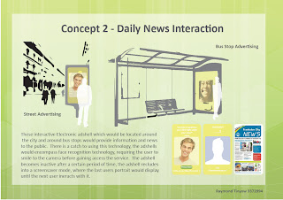
The strongest concept that I had was concept 2.  Concept 1 & 3 were good concepts, but they were to app-like which focused heavily on the service, which somewhat made the product itself weak and redundant.  The 2nd concept had the most merit as it was innovative and different, the service part of it was spot on, but could be focused more specifically on mental health subtlely rather than general news itself.  Should look into the rules of privacy and wether there are rule against keeping a photo of someone for a specific time, and possibly add a warning or option that a photo is being taken.  Should look deeply into the psychology of smiling and what it means to smile and what it involves and how smiling affects mental health especially.

Feed back from Ryan Go :
The first 2 concepts have the most merit, he really enjoys the idea of the 2nd concept which really aims to brighton the lives of everyday normal people in random fashion, which is really cool.  The first concept is great because it engages people from the community with each other.

Feedback from Daniel :
Daniel Really liked the 2nd concept and wasn't too sure if the 3rd concept was viable, he was worried about the durability of the tablets and also that the idea of depression and anxiety wasn't subtle enough and it might deter people away.  

Action plan for upcoming week : 
The plan for this week is to continue to do more research into the area of mental health, and then dfive into research of smiling especially into further depth.  To research into the effects of smiling on mental well-being and the laws and regulations of privacy and photo taking.  Possibly research into colours and how effective street advertising is especially in bus stop shelters.

Sunday 1 September 2013

Peer comments

Pamela Ablang
http://pamablang.blogspot.com.au/2013/09/blog-post.html?
showComment=1378091865162#c2676490934627292576

Matthew Federick
http://mfredrick.blogspot.com.au/2013/09/cormak-probiotic-drink-bottle-wholesome.html?showComment=1378092079761#c7330762113133027358

Doug Cusack
http://dougcusackides3222.blogspot.com.au/2013/09/final-submission-project-1.html?showComment=1378092279512#c2178442363241696936

Daniel Foo
http://fooides.blogspot.com.au/2013/08/studio-cormak-packaging-design.html?showComment=1378092502976

Ben Ma
http://mabenjamin.blogspot.com.au/2013/08/accessible-packaging-milk-container.html?showComment=1378093102097

Accessible Packaging


Rationale

Raymond Tinyow 3372992


The re-design of the packaging of olive oil is to specifically cater for those who are suffering from arthritis, ad as well as anyone who suffers from some sort of impairment in the hands, whist yet at the same time not causing a disadvantage to others.  The benefits of olive oil associated with arthritis are that it has the ability to dampen inflammation. The shape of the body itself is shaped ergonomically to allow for it to be easily picked up with one hand.  There are guidelines in place that suggest that if an object were to be picked dup in one hand comfortably it should not have a switch of more than 71mm.  The bottle cap while traditionally a aluminum screw on has to be re-designed into a HDPE nozzle, that is able to shut on and off, through a snap on twisting mechanism.  There are essentially two parts to the mechanism where there is a inner lid and outer.  The inner lid screws on to the bottle while the outer lid snaps onto it. 

The labeling has been designed closely to many suggested guidelines for designing to cater the needs of those with arthritis.  The design manages to be sleek and minimal at the same time.  For important elements such as warnings and instructions, bold characters are used to create contrast in order to highlight its importance.  The use of lower case in combination with upper case and is carefully thought, where the pure use of upper case letters is hard to read.